
A brand that was born in Munich in 1397 and inaugurated the Munich Helles style, Spaten has crossed time. Can a more than 600 years old brand connect with today’s audience? Can the medieval be contemporary? Invited by the studio Ana Couto, we designed an exclusive typeface to star in a visual identity inspired by the neomedieval.
Uma marca que nasceu em Munique em 1397, e inaugurou o estilo Munich Helles, Spaten atravessou o tempo. Pode uma marca de mais de 600 anos se conectar ao público atual? O medieval pode ser moderno? À convite do estúdio Ana Couto, projetamos uma tipografia exclusiva para protagonizar uma identidade visual inspirada no neomedieval.

We believe that successful corporate typefaces balance expressiveness with functionality. They need to have proprietary elements to trigger brand recognition. For Spaten, we took the letters of the logotype — with its distinctive ‘S’ — and expanded them into a complete typeface. Every letter, figure and diacritic carry the Spaten story.
Acreditamos que uma tipografia corporativa bem sucedida equilibra expressividade com funcionalidade. É preciso haver elementos proprietários para facilitar o reconhecimento da marca. Para Spaten, partimos das letras do logotipo — que possui um ’S’ distinto — e as expandimos para uma tipografia completa. Cada letra, número e acento carrega a história da Spaten.
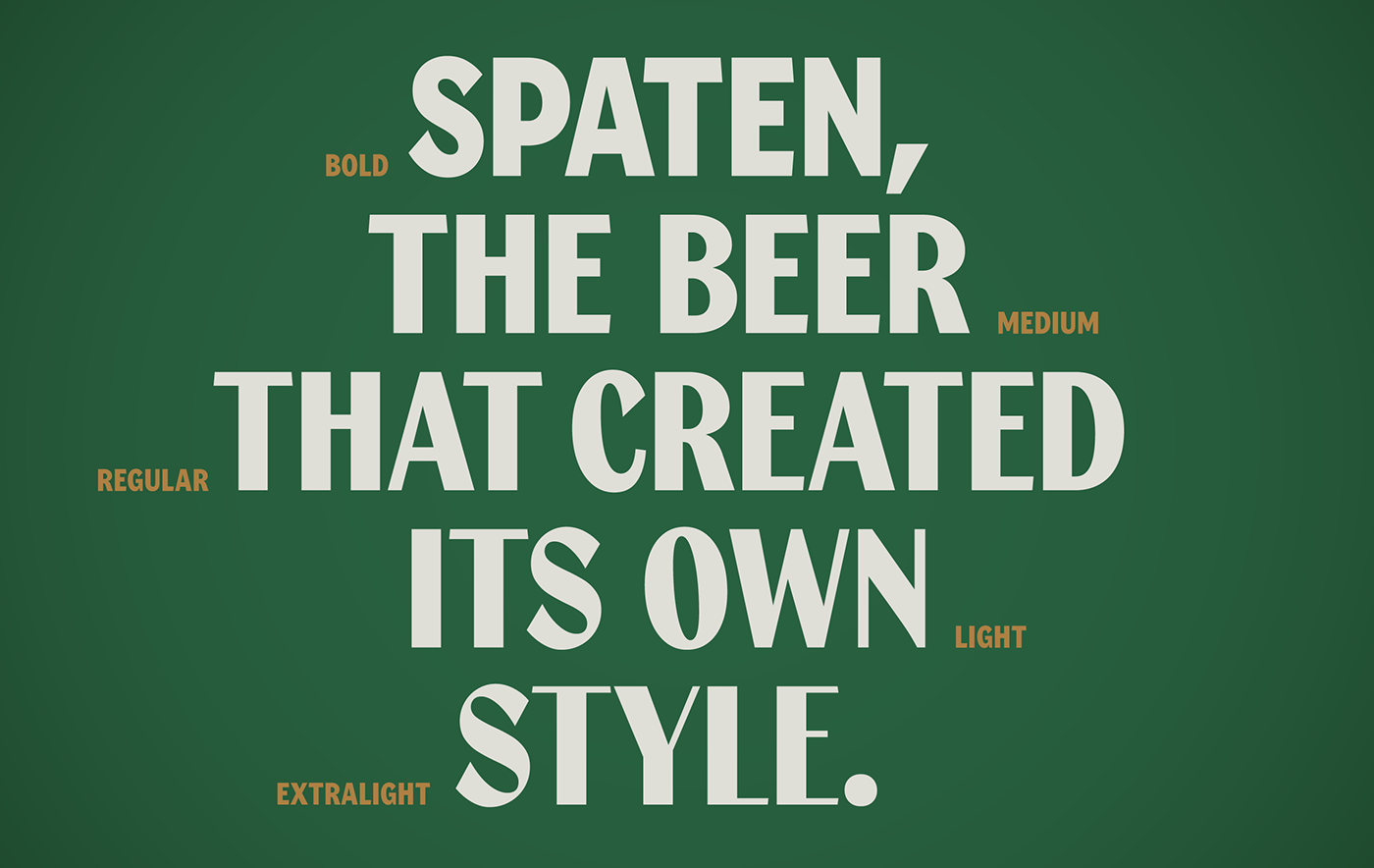

“Refine your admirable side” was the guiding thread that gave consistency to the project. ‘To refine’ means to perfect and improve: people, qualities and truths over time. The more time passes, the more refined it gets. This movement is present in the variable typeface, which moves between the traditional and the contemporary with the precision of a slider, offering a lot of flexibility to brand communication. In promotions and retail messages, the version with low thick and thin contrast provides strength and impact, while at the other extreme, the thin, sculptural strokes — evident in ‘C’, ‘S’, ‘3’ or ‘7’ — reveal the richness and sophistication of this historic beer.
“Apurar o seu lado admirável” foi o fio condutor que deu consistência ao projeto. ‘Apurar’ significa aperfeiçoar e aprimorar: pessoas, qualidades e verdades através do tempo. Quanto mais tempo passa, mais apurado fica. Este movimento está presente na tipografia variável, que transita entre o tradicional e o contemporâneo com a precisão de um slider, oferecendo muita versatilidade à comunicação. Em promoções e mensagens de varejo, a versão com baixo contraste grosso/fino oferece força e impacto, enquanto no outro extremo, os traços finos e esculturais — evidentes em ‘C’, ’S’, ‘3’ ou ‘7’ — revelam a riqueza e a sofisticação desta cerveja histórica.


Spaten Variable is an example of the conscious use of variable font technology applied genuinely to the brand story. A toast!
A Spaten Variable demonstra o uso consciente da tecnologia de fontes variáveis aplicada de forma genuína à história da marca. Um brinde!

Fabio Haag Type: Henrique Beier, Eduilson Coan, Ana Laydner and Fabio Haag; Ana Couto: Danilo Cid, Rafael Torres, Julia Garcia, Luiza Cortoni, Isabella Herdy, Gabriel Martoni, Fernando Contato, Lucas Figueira, Julia Sobral, João de Braz, Allesandra Dias and Nelson Guimarães. Ambev: Pedro Adamy, Peter De Albuquerque, Joice Carvalho and Gabriela Sebba.
We are immensely happy with your interest in our small and independent foundry. Learn more and download our fonts to try.


